
 |
| © Andrés Sánchez, Image 1 |
fototazo began a mentorship program in 2012, matching young Colombian photographers with mentors from across the spectrum of the photographic world - gallery owners, bloggers, academics, art directors and working photographers. The goal is to provide the young photographers with commentary and advice on their work from professionals in the field and to expand their network and knowledge of resources beyond Colombia.
The program started behind the scenes, but in an effort to create a singular conversation, share with readers work being made by the photographers and under the belief that the advice, insight and ways of talking about images offered by the mentors will be useful and interesting to other photographers, we are experimenting with making the process a public one.
We periodically feature a selection of images from a photographer involved in the program and comments from mentors. The current photographer and comments will be housed under the classroom tab above and older posts will be available through the site links page.
This post features the work of Andrés Sánchez - who was our 12th microgrant recipient - and comments from his assigned mentor, Amani Willett, as well as additional comments from Dawn Roe.
The image numbers in the text correspond to those below the images in the caption.
______________________________
 |
| © Andrés Sánchez, Image 2 |
Statement
My research work focuses on the search for the expression of pain, how to represent that feeling that is intangible and often inexpressible. My work also focuses on how the medical world objectifies the human body, how it analyzes, fragments, divides, classifies, encases, displays, invades, removes, transforms, wraps, sews and burns it, how it makes it sick and how it makes it better. Science does this and the body puts up with it, that is our times. But how do you do these things with the soul, the spirit? How do we paste a heart divided, how do we ensure that the pain of the heart does not kill other vital organs, leaving us spiritually crippled? How do we locate the most difficult pain to bear, the intangible, the diffuse (that we don’t know where it is exactly) as it gores from the tears to the chest and back up to the thoughts.
When the soul hurts, what?
When neglect hurts us, what do we do? And when are we forgotten? What can we take? Pills don't exist for negligence, or injections for heartbreak; that is what we would like, for happiness to come in strips of 12 units, in patches, or syrups in order to face the world. To kill physical pain many products exist, but for the soul nothing physical exists to help us heal it.
 |
| © Andrés Sánchez, Image 3 |
The project continues to grow and continues to change.
Questions for mentors
1- To what extent can I let my work take the course that it wants to take and when should I intervene to keep it on the path I always had in mind for it? I ask this because my photographs initially sought a kind of cure for my ailments, but the project has become a visual representation of what could be called pain.
2- What advice or opinions would you have about technical issues for me? For example: the lighting, color palette, textures, etc.
3- And finally, would you have any references for me to consider so I can continue enriching my base of technique and knowledge of other photographers?
Thank you,
Andrés Sánchez Muñoz
______________________________
 |
| © Andrés Sánchez, Image 4 |
Hi Andrés
Thank you for sharing your writing and your pictures with us – especially with what can be such a personal topic. It was a pleasure to read your statement and learn a bit about you. Jumping right in...
The way you have written your statement, I get the sense that you are staking out an intellectual or cerebral approach to your image-making - that you are trying to solve the problem of how to visually represent an intangible feeling. At the same time, there are a lot of other ideas you are trying to tackle with this project and it may be slightly too ambitious in its current scope. As an exercise, I'd try parsing down your statement to one or two sentences – this might help focus your ideas for now. Your ideas about the medical world are very interesting, but also could be a project of its own. I think it would be prudent to start the project by focusing on one idea - either trying to visually represent pain or examining how the medical world deals with the human body. Once you have secured a good understanding of how you want to work with one of the ideas, there may be an opportunity to expand the scope of the work.
Many of the images you have shared with us are very strong - and quite striking. In particular, the first three pictures begin to describe a world that is quite different from what I visualize when I think about hospitals and medical care. I love the perspective of the image of the light in the medical office, especially when juxtaposed with the image of the young man (you?) bathed in eerie light. I'm very curious to know more about that portrait – was it made in a medical facility using the light from medical equipment? That could be a terrific approach for the images in this series. That being said, overall, the pictures feel more emotionally driven than the mental picture I got from reading your statement. I could very well have misinterpreted my reading of your statement.
 |
| © Andrés Sánchez, Image 5 |
 |
| © Andrés Sánchez, Image 6 |
 |
| © Andrés Sánchez, Image 7 |
As you work on this project, it will be useful to keep in mind that many photographers have tackled the subjects of personal pain, struggling, depression and the like. Some of the images in the middle and end of your series of images, while strong, are images that show pain in a way that I would expect or that I've seen before. Your challenge will be how to represent these ideas in a new way.
Similarly, as many photographers have photographed pain, there have also been many approaches taken to illustrate those ideas. I think if you start refining and defining your approach to your image-making, it will be helpful in advancing the project. Think about the best way to illustrate your ideas...do you want tackle this project from a personal narrative perspective, a journalistic perspective, a conceptual perspective, an abstract perspective, etc.
For example, in the images you have shared, I can see a few approaches being utilized, which I would loosely call personal narrative and conceptual. You could definitely continue along those lines as the project develops. As mentioned before, the challenge will be how to create images, and a narrative, that show a fresh and new take on the themes. Additionally, for personal narrative projects to be successful, they often involve having the courage to lay it all bare – being willing to share everything. A photographer to look at who does this well would be Elinor Carucci, especially the projects "Pain" and "Crisis."
 |
| © Andrés Sánchez, Image 8 |
Alternatively, you could approach the project from a more cerebral point of view, which would be in line with the first sentence of your artist statement. In this approach you could literally try and find ways to make images to represent something that are, in your words, "intangible, inexpressible." There is a strong tradition of photographers using the medium to try and capture that which is not able to be photographed and I think your project could also add nicely to that tradition. There was a recent group show on the Humble Arts Foundation site dealing with images that attempt to capture the spirit. It's not exactly the same topic, but I think the show will give you a lot of great ideas. It's called "Group Show 42: Occultisms."
I know you are also curious about how much to direct your work or let it run free. It's a tough question! I'm always a proponent of having the flexibility to let the work lead you where it wants to go – and you should definitely have that flexibility. At the same time, your statement contains some very specific and complicated ideas which will require a fair amount of discipline and attention. I don't know how long you have been working on the project to date, but if you have the time, I would definitely advocate taking a month or two to experiment with a lot of different ways you could express your ideas.
I hope this all helps. I'm very excited to see how the project develops. You have a lot of wonderful ideas and images already on the table!
Response from Dawn Roe
Dear Andrés,
I really enjoyed having the opportunity to look over your work, there are so many striking images within your series – I see a lot of potential here, and encourage you to keep thinking through your ideas as you push the project forward. My responses to each of your images (below) were written without referring back to your artist statement (which I had read about a month ago), and are based primarily on my response to how the images worked together as a group, and which images appeared strongest to me.
When I view this series, I am led to think of the conflict between modern medicine and personal belief systems (often based upon religious upbringing or shared cultural history). Ultimately, I read the strongest images as conveying a sense of the mysteries of the unknown and the internal, psychological pressures that accompany this – and perhaps how these aspects are amplified when the body is under physical stress due to illness or disease, sometimes confined to spaces that are unfamiliar or undesirable. I enjoy the ambiguity that is accentuated by the heavy, cool presence of the blue that dominates, and the dark spaces that suggest the unknown. Overall, there is a very clear sensibility that comes through strongly, but is best conveyed when a bit of restraint is shown in terms of the construction of the images and their visual treatment.
I agree with Amani's very insightful comments regarding your statement and also encourage you to spend time really considering the complex (and varied) nature of the content you purport to be exploring. I think the latter portion of your statement starts to get at what I, as a viewer, am seeing in your images. I think it would be useful to really consider how you are framing the work through language in relation to the visual actuality of the photographs. Sometimes the work shifts a bit as you are sorting it out – it may be that you've started the project with one idea, yet you are discovering new strands of ideas as the imagery and the ideas progress. I think you should allow the work to run the course that feels natural to you.
As to your technical issues – you seem to be able to obtain the kind of mood/feeling that you hoping for with your treatment, just keep an eye on consistency in terms of cool/warm palettes – it's not that you can't combine the two, it should just seem purposeful. Be wary of unintended color casts. And, do try to pull out just a hint of information in some of the deep black areas so they don't read as complete voids (unless, of course, that is absolutely your intention) – same goes for the extreme highlight areas.
Below are my comments on the individual images –
#1 – Beautiful, rich blues – the slightly off kilter framing instills a certain amount of energy and activity – it's an active composition in this way. I also enjoy the delicacy of the embroidered curtain contrasting with the see-through quality of the fabric the figure is draped in – which only after a longer look begins to appear as though it is made of paper, as a hospital dressing gown would be.
#2 – Also strong, follows #1 nicely, but the lack of focus is a bit jarring following the very crisply detailed silhouette in #1. I do enjoy the movement present in the body in this image, and the function of the light toward the center of the image. Also, the gesture of the raised right arm with left hand pointing toward chest, and the downward gaze – a certain referencing of religious iconography is present. The very ambiguous patterned background almost reads like a projection as well, or an underwater space.
#3 – There is potential here, but the blown out highlights do not read as being purposefully handled in that manner. The texture in the fabric toward the bottom of the image – reading simultaneously like lace and gauze – works nicely, but the complete eradication of detail toward the top/middle is distracting to me. Perhaps you could work toward retaining the blinding glow of the device/light while still creating a richer print.
#4 – This image takes us out of an otherworldly/fantastic/dreamlike space into a much more "real" environment, due to the quality of light and lack of overwhelming blue hue – I'm not sure this image is as strong as the others as there is not as much to latch onto here, although I do enjoy the emotion conveyed from the sort of cowering figure. Perhaps there is another version of this image that would work better within the sequence.
#5 – This is a beautiful image that contains that same sort of airy quality that the blinding light in #3 could have. Here the lack of detail in the top is less important, as it suggests a certain emptiness. I appreciate how it feels as though the feet are floating upward – this image is teetering a bit close to a cliché in terms of "going into the light" but its minimal quality works in its favor (on a technical note – it might be worth fiddling around a bit with the color fringing that happens around the edges, just to make sure the image reads as you would like it too – a bit of a magenta/red cast creeping in).
#6- I enjoy this image, but in some ways it feels as though it belongs to another series. The interior space becomes the most important thing and the figure in the corner gets very lost. Compositionally, it's a little bit awkward as well, due to the framing of the silhouetted furniture in the foreground.
#7 – This one is not as strong for me, due to the warmth of the image (it is the only one in the series treated in this manner) and the lack of focus.
#8 – Really strong one here – I could almost see this closing the series. This has just the right amount of obscured and revealed information – and the ever so slight inclusion of just a bit of warmth along the arm contrasts so perfectly with the hazy blue/violet light surrounding. The inference of a wrought iron bed frame injects a nice bit of narrative as well, that lets the viewer conjure a certain type of space/place.
#9 – I'm immediately distracted by the green cast in this image, but it's also not nearly as strong as your others in terms of composition and art direction. There is too much specificity for me – the painted toenails, the curtain rod, the fruits on the fabric. I view this and immediately think of the image's construction.
#10 – This one I like, but again it's hovering pretty close to the edge of a literal representation of an idea/thought/feeling – I think as long as you are careful about where and how it is presented in the series, it will work. The way the light is falling on the feet is really nice and sets them off from the background – as well, the slice of hospital gown around the knees helps add just a bit of crucial detail that impacts the response. I also appreciate the cold feeling of the tile floor that is so present for me, and the allowance of the light emanating from the window to be seen (although, I also wonder how the image would read with the window excluded from the frame, and the light appearing on its "own").
#11 – This one is far too clinical for me, and very commercial looking. It's the only one of its kind (at this point). Might just be too direct and not necessary. Although, as an image on its own, I do appreciate the intensity of the focus on the needle's sharp point, and the composition itself. Perhaps if there were other images that highlighted the materials/tools/methodologies of these medical spaces, this could work – but ultimately you'll need to think about the direction/nature of the series as a whole. There is almost a sci-fi feeling that starts to come in when I view the ascending feet prior to this image and then see the needle. A particular kind of narrative starts to emerge, and I'm not sure that's what you are going for.
#12 – Not quite enough information in this image and a little too romantic for me – the beautiful, pouty lips and the head cocked off to the side read a bit more like a fashion ad than perhaps you are intending. Something kind of nice about the pattern on the body being produced by the shadow though (makes me think a bit of a confessional).
#13 – There is potential in this idea, perhaps, but this is again a bit more direct than some of your other more successfully ambiguous images. It does refer back to historical/religious painting again, which might be nice, but the lack of clear focus somewhere in the image is also a bit distracting.
#14 – Similar to #12, a bit too close to a fashion advertisement for me. As well, I can't tell if those are Christmas lights in/around the head or something else – it seems a bit inadvertently quirky. As well, it certainly visually refers to Jesus and the crown of thorns, but it's not clear why it would be represented in this way – at this point in the series (also, it doesn't contain the rich blue that seems to be such a large part of tying the series together).
#15 – This last one seems to be kind of a different version of the first image, and I find the first image more successful. Although I do appreciate the sort of "heavenly" light surrounding the figure in this image, as well as the very nicely rendered subtle movement of the hands, the inclusion of the upturned head and just slight amount of expression able to be discerned on the face is distracting and, again, a bit too literal for me.
Keep going!
Dawn Roe
I know you are also curious about how much to direct your work or let it run free. It's a tough question! I'm always a proponent of having the flexibility to let the work lead you where it wants to go – and you should definitely have that flexibility. At the same time, your statement contains some very specific and complicated ideas which will require a fair amount of discipline and attention. I don't know how long you have been working on the project to date, but if you have the time, I would definitely advocate taking a month or two to experiment with a lot of different ways you could express your ideas.
I hope this all helps. I'm very excited to see how the project develops. You have a lot of wonderful ideas and images already on the table!
_______________________________
 |
| © Andrés Sánchez, Image 9 |
Dear Andrés,
I really enjoyed having the opportunity to look over your work, there are so many striking images within your series – I see a lot of potential here, and encourage you to keep thinking through your ideas as you push the project forward. My responses to each of your images (below) were written without referring back to your artist statement (which I had read about a month ago), and are based primarily on my response to how the images worked together as a group, and which images appeared strongest to me.
When I view this series, I am led to think of the conflict between modern medicine and personal belief systems (often based upon religious upbringing or shared cultural history). Ultimately, I read the strongest images as conveying a sense of the mysteries of the unknown and the internal, psychological pressures that accompany this – and perhaps how these aspects are amplified when the body is under physical stress due to illness or disease, sometimes confined to spaces that are unfamiliar or undesirable. I enjoy the ambiguity that is accentuated by the heavy, cool presence of the blue that dominates, and the dark spaces that suggest the unknown. Overall, there is a very clear sensibility that comes through strongly, but is best conveyed when a bit of restraint is shown in terms of the construction of the images and their visual treatment.
 |
| © Andrés Sánchez, Image 10 |
I agree with Amani's very insightful comments regarding your statement and also encourage you to spend time really considering the complex (and varied) nature of the content you purport to be exploring. I think the latter portion of your statement starts to get at what I, as a viewer, am seeing in your images. I think it would be useful to really consider how you are framing the work through language in relation to the visual actuality of the photographs. Sometimes the work shifts a bit as you are sorting it out – it may be that you've started the project with one idea, yet you are discovering new strands of ideas as the imagery and the ideas progress. I think you should allow the work to run the course that feels natural to you.
As to your technical issues – you seem to be able to obtain the kind of mood/feeling that you hoping for with your treatment, just keep an eye on consistency in terms of cool/warm palettes – it's not that you can't combine the two, it should just seem purposeful. Be wary of unintended color casts. And, do try to pull out just a hint of information in some of the deep black areas so they don't read as complete voids (unless, of course, that is absolutely your intention) – same goes for the extreme highlight areas.
Below are my comments on the individual images –
#1 – Beautiful, rich blues – the slightly off kilter framing instills a certain amount of energy and activity – it's an active composition in this way. I also enjoy the delicacy of the embroidered curtain contrasting with the see-through quality of the fabric the figure is draped in – which only after a longer look begins to appear as though it is made of paper, as a hospital dressing gown would be.
#2 – Also strong, follows #1 nicely, but the lack of focus is a bit jarring following the very crisply detailed silhouette in #1. I do enjoy the movement present in the body in this image, and the function of the light toward the center of the image. Also, the gesture of the raised right arm with left hand pointing toward chest, and the downward gaze – a certain referencing of religious iconography is present. The very ambiguous patterned background almost reads like a projection as well, or an underwater space.
 |
| © Andrés Sánchez, Image 11 |
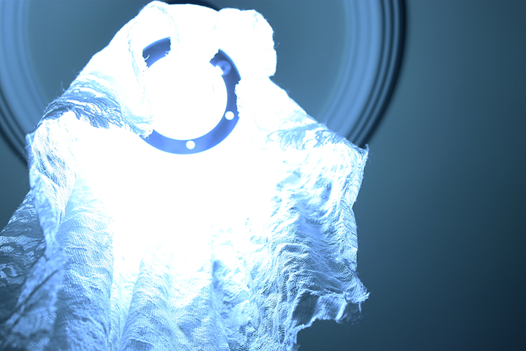
#3 – There is potential here, but the blown out highlights do not read as being purposefully handled in that manner. The texture in the fabric toward the bottom of the image – reading simultaneously like lace and gauze – works nicely, but the complete eradication of detail toward the top/middle is distracting to me. Perhaps you could work toward retaining the blinding glow of the device/light while still creating a richer print.
#4 – This image takes us out of an otherworldly/fantastic/dreamlike space into a much more "real" environment, due to the quality of light and lack of overwhelming blue hue – I'm not sure this image is as strong as the others as there is not as much to latch onto here, although I do enjoy the emotion conveyed from the sort of cowering figure. Perhaps there is another version of this image that would work better within the sequence.
#5 – This is a beautiful image that contains that same sort of airy quality that the blinding light in #3 could have. Here the lack of detail in the top is less important, as it suggests a certain emptiness. I appreciate how it feels as though the feet are floating upward – this image is teetering a bit close to a cliché in terms of "going into the light" but its minimal quality works in its favor (on a technical note – it might be worth fiddling around a bit with the color fringing that happens around the edges, just to make sure the image reads as you would like it too – a bit of a magenta/red cast creeping in).
#6- I enjoy this image, but in some ways it feels as though it belongs to another series. The interior space becomes the most important thing and the figure in the corner gets very lost. Compositionally, it's a little bit awkward as well, due to the framing of the silhouetted furniture in the foreground.
#7 – This one is not as strong for me, due to the warmth of the image (it is the only one in the series treated in this manner) and the lack of focus.
 |
| © Andrés Sánchez, Image 12 |
#8 – Really strong one here – I could almost see this closing the series. This has just the right amount of obscured and revealed information – and the ever so slight inclusion of just a bit of warmth along the arm contrasts so perfectly with the hazy blue/violet light surrounding. The inference of a wrought iron bed frame injects a nice bit of narrative as well, that lets the viewer conjure a certain type of space/place.
#9 – I'm immediately distracted by the green cast in this image, but it's also not nearly as strong as your others in terms of composition and art direction. There is too much specificity for me – the painted toenails, the curtain rod, the fruits on the fabric. I view this and immediately think of the image's construction.
 |
| © Andrés Sánchez, Image 13 |
#10 – This one I like, but again it's hovering pretty close to the edge of a literal representation of an idea/thought/feeling – I think as long as you are careful about where and how it is presented in the series, it will work. The way the light is falling on the feet is really nice and sets them off from the background – as well, the slice of hospital gown around the knees helps add just a bit of crucial detail that impacts the response. I also appreciate the cold feeling of the tile floor that is so present for me, and the allowance of the light emanating from the window to be seen (although, I also wonder how the image would read with the window excluded from the frame, and the light appearing on its "own").
#11 – This one is far too clinical for me, and very commercial looking. It's the only one of its kind (at this point). Might just be too direct and not necessary. Although, as an image on its own, I do appreciate the intensity of the focus on the needle's sharp point, and the composition itself. Perhaps if there were other images that highlighted the materials/tools/methodologies of these medical spaces, this could work – but ultimately you'll need to think about the direction/nature of the series as a whole. There is almost a sci-fi feeling that starts to come in when I view the ascending feet prior to this image and then see the needle. A particular kind of narrative starts to emerge, and I'm not sure that's what you are going for.
 |
| © Andrés Sánchez, Image 14 |
#12 – Not quite enough information in this image and a little too romantic for me – the beautiful, pouty lips and the head cocked off to the side read a bit more like a fashion ad than perhaps you are intending. Something kind of nice about the pattern on the body being produced by the shadow though (makes me think a bit of a confessional).
#13 – There is potential in this idea, perhaps, but this is again a bit more direct than some of your other more successfully ambiguous images. It does refer back to historical/religious painting again, which might be nice, but the lack of clear focus somewhere in the image is also a bit distracting.
#14 – Similar to #12, a bit too close to a fashion advertisement for me. As well, I can't tell if those are Christmas lights in/around the head or something else – it seems a bit inadvertently quirky. As well, it certainly visually refers to Jesus and the crown of thorns, but it's not clear why it would be represented in this way – at this point in the series (also, it doesn't contain the rich blue that seems to be such a large part of tying the series together).
#15 – This last one seems to be kind of a different version of the first image, and I find the first image more successful. Although I do appreciate the sort of "heavenly" light surrounding the figure in this image, as well as the very nicely rendered subtle movement of the hands, the inclusion of the upturned head and just slight amount of expression able to be discerned on the face is distracting and, again, a bit too literal for me.
Keep going!
Dawn Roe
 |
| © Andrés Sánchez, Image 15 |