Showing posts with label Dawn Roe. Show all posts

1.12.2015

Classroom: Andrés Sánchez

© Andrés Sánchez, Image 1


fototazo began a mentorship program in 2012, matching young Colombian photographers with mentors from across the spectrum of the photographic world - gallery owners, bloggers, academics, art directors and working photographers. The goal is to provide the young photographers with commentary and advice on their work from professionals in the field and to expand their network and knowledge of resources beyond Colombia.

The program started behind the scenes, but in an effort to create a singular conversation, share with readers work being made by the photographers and under the belief that the advice, insight and ways of talking about images offered by the mentors will be useful and interesting to other photographers, we are experimenting with making the process a public one.

We periodically feature a selection of images from a photographer involved in the program and comments from mentors. The current photographer and comments will be housed under the classroom tab above and older posts will be available through the site links page.

This post features the work of Andrés Sánchez - who was our 12th microgrant recipient - and comments from his assigned mentor, Amani Willett, as well as additional comments from Dawn Roe.

The image numbers in the text correspond to those below the images in the caption.
______________________________

© Andrés Sánchez, Image 2

Statement
My research work focuses on the search for the expression of pain, how to represent that feeling that is intangible and often inexpressible. My work also focuses on how the medical world objectifies the human body, how it analyzes, fragments, divides, classifies, encases, displays, invades, removes, transforms, wraps, sews and burns it, how it makes it sick and how it makes it better. Science does this and the body puts up with it, that is our times. But how do you do these things with the soul, the spirit? How do we paste a heart divided, how do we ensure that the pain of the heart does not kill other vital organs, leaving us spiritually crippled? How do we locate the most difficult pain to bear, the intangible, the diffuse (that we don’t know where it is exactly) as it gores from the tears to the chest and back up to the thoughts.

When the soul hurts, what?

When neglect hurts us, what do we do? And when are we forgotten? What can we take? Pills don't exist for negligence, or injections for heartbreak; that is what we would like, for happiness to come in strips of 12 units, in patches, or syrups in order to face the world. To kill physical pain many products exist, but for the soul nothing physical exists to help us heal it.
© Andrés Sánchez, Image 3

The project continues to grow and continues to change.

Questions for mentors
1- To what extent can I let my work take the course that it wants to take and when should I intervene to keep it on the path I always had in mind for it? I ask this because my photographs initially sought a kind of cure for my ailments, but the project has become a visual representation of what could be called pain.

2- What advice or opinions would you have about technical issues for me? For example: the lighting, color palette, textures, etc.

3- And finally, would you have any references for me to consider so I can continue enriching my base of technique and knowledge of other photographers?

Thank you,

Andrés Sánchez Muñoz
______________________________

© Andrés Sánchez, Image 4
Response from Amani Willett

Hi Andrés

Thank you for sharing your writing and your pictures with us – especially with what can be such a personal topic. It was a pleasure to read your statement and learn a bit about you. Jumping right in...

The way you have written your statement, I get the sense that you are staking out an intellectual or cerebral approach to your image-making - that you are trying to solve the problem of how to visually represent an intangible feeling. At the same time, there are a lot of other ideas you are trying to tackle with this project and it may be slightly too ambitious in its current scope. As an exercise, I'd try parsing down your statement to one or two sentences – this might help focus your ideas for now. Your ideas about the medical world are very interesting, but also could be a project of its own. I think it would be prudent to start the project by focusing on one idea - either trying to visually represent pain or examining how the medical world deals with the human body.  Once you have secured a good understanding of how you want to work with one of the ideas, there may be an opportunity to expand the scope of the work.

Many of the images you have shared with us are very strong - and quite striking.  In particular, the first three pictures begin to describe a world that is quite different from what I visualize when I think about hospitals and medical care. I love the perspective of the image of the light in the medical office, especially when juxtaposed with the image of the young man (you?) bathed in eerie light.  I'm very curious to know more about that portrait – was it made in a medical facility using the light from medical equipment?  That could be a terrific approach for the images in this series. That being said, overall, the pictures feel more emotionally driven than the mental picture I got from reading your statement.  I could very well have misinterpreted my reading of your statement.

© Andrés Sánchez, Image 5

© Andrés Sánchez, Image 6

© Andrés Sánchez, Image 7

As you work on this project, it will be useful to keep in mind that many photographers have tackled the subjects of personal pain, struggling, depression and the like. Some of the images in the middle and end of your series of images, while strong, are images that show pain in a way that I would expect or that I've seen before. Your challenge will be how to represent these ideas in a new way.

Similarly, as many photographers have photographed pain, there have also been many approaches taken to illustrate those ideas. I think if you start refining and defining your approach to your image-making, it will be helpful in advancing the project. Think about the best way to illustrate your ideas...do you want tackle this project from a personal narrative perspective, a journalistic perspective, a conceptual perspective, an abstract perspective, etc.

For example, in the images you have shared, I can see a few approaches being utilized, which I would loosely call personal narrative and conceptual. You could definitely continue along those lines as the project develops. As mentioned before, the challenge will be how to create images, and a narrative, that show a fresh and new take on the themes. Additionally, for personal narrative projects to be successful, they often involve having the courage to lay it all bare – being willing to share everything. A photographer to look at who does this well would be Elinor Carucci, especially the projects "Pain" and "Crisis."

© Andrés Sánchez, Image 8

Alternatively, you could approach the project from a more cerebral point of view, which would be in line with the first sentence of your artist statement. In this approach you could literally try and find ways to make images to represent something that are, in your words, "intangible, inexpressible." There is a strong tradition of photographers using the medium to try and capture that which is not able to be photographed and I think your project could also add nicely to that tradition. There was a recent group show on the Humble Arts Foundation site dealing with images that attempt to capture the spirit. It's not exactly the same topic, but I think the show will give you a lot of great ideas. It's called "Group Show 42: Occultisms."

I know you are also curious about how much to direct your work or let it run free. It's a tough question! I'm always a proponent of having the flexibility to let the work lead you where it wants to go – and you should definitely have that flexibility. At the same time, your statement contains some very specific and complicated ideas which will require a fair amount of discipline and attention. I don't know how long you have been working on the project to date, but if you have the time, I would definitely advocate taking a month or two to experiment with a lot of different ways you could express your ideas.

I hope this all helps. I'm very excited to see how the project develops. You have a lot of wonderful ideas and images already on the table!
_______________________________

© Andrés Sánchez, Image 9
Response from Dawn Roe

Dear Andrés,

I really enjoyed having the opportunity to look over your work, there are so many striking images within your series – I see a lot of potential here, and encourage you to keep thinking through your ideas as you push the project forward. My responses to each of your images (below) were written without referring back to your artist statement (which I had read about a month ago), and are based primarily on my response to how the images worked together as a group, and which images appeared strongest to me.

When I view this series, I am led to think of the conflict between modern medicine and personal belief systems (often based upon religious upbringing or shared cultural history). Ultimately, I read the strongest images as conveying a sense of the mysteries of the unknown and the internal, psychological pressures that accompany this – and perhaps how these aspects are amplified when the body is under physical stress due to illness or disease, sometimes confined to spaces that are unfamiliar or undesirable. I enjoy the ambiguity that is accentuated by the heavy, cool presence of the blue that dominates, and the dark spaces that suggest the unknown. Overall, there is a very clear sensibility that comes through strongly, but is best conveyed when a bit of restraint is shown in terms of the construction of the images and their visual treatment.

© Andrés Sánchez, Image 10

I agree with Amani's very insightful comments regarding your statement and also encourage you to spend time really considering the complex (and varied) nature of the content you purport to be exploring. I think the latter portion of your statement starts to get at what I, as a viewer, am seeing in your images. I think it would be useful to really consider how you are framing the work through language in relation to the visual actuality of the photographs. Sometimes the work shifts a bit as you are sorting it out – it may be that you've started the project with one idea, yet you are discovering new strands of ideas as the imagery and the ideas progress.  I think you should allow the work to run the course that feels natural to you.

As to your technical issues – you seem to be able to obtain the kind of mood/feeling that you hoping for with your treatment, just keep an eye on consistency in terms of cool/warm palettes – it's not that you can't combine the two, it should just seem purposeful. Be wary of unintended color casts. And, do try to pull out just a hint of information in some of the deep black areas so they don't read as complete voids (unless, of course, that is absolutely your intention) – same goes for the extreme highlight areas.

Below are my comments on the individual images –

#1 – Beautiful, rich blues – the slightly off kilter framing instills a certain amount of energy and activity – it's an active composition in this way. I also enjoy the delicacy of the embroidered curtain contrasting with the see-through quality of the fabric the figure is draped in – which only after a longer look begins to appear as though it is made of paper, as a hospital dressing gown would be.

#2 – Also strong, follows #1 nicely, but the lack of focus is a bit jarring following the very crisply detailed silhouette in #1. I do enjoy the movement present in the body in this image, and the function of the light toward the center of the image. Also, the gesture of the raised right arm with left hand pointing toward chest, and the downward gaze – a certain referencing of religious iconography is present. The very ambiguous patterned background almost reads like a projection as well, or an underwater space.

© Andrés Sánchez, Image 11

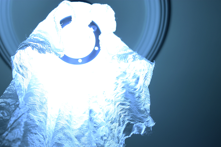
#3 – There is potential here, but the blown out highlights do not read as being purposefully handled in that manner. The texture in the fabric toward the bottom of the image – reading simultaneously like lace and gauze – works nicely, but the complete eradication of detail toward the top/middle is distracting to me. Perhaps you could work toward retaining the blinding glow of the device/light while still creating a richer print.

#4 – This image takes us out of an otherworldly/fantastic/dreamlike space into a much more "real" environment, due to the quality of light and lack of overwhelming blue hue – I'm not sure this image is as strong as the others as there is not as much to latch onto here, although I do enjoy the emotion conveyed from the sort of cowering figure. Perhaps there is another version of this image that would work better within the sequence.

#5 – This is a beautiful image that contains that same sort of airy quality that the blinding light in #3 could have. Here the lack of detail in the top is less important, as it suggests a certain emptiness. I appreciate how it feels as though the feet are floating upward – this image is teetering a bit close to a cliché in terms of "going into the light" but its minimal quality works in its favor (on a technical note – it might be worth fiddling around a bit with the color fringing that happens around the edges, just to make sure the image reads as you would like it too – a bit of a magenta/red cast creeping in).

#6- I enjoy this image, but in some ways it feels as though it belongs to another series. The interior space becomes the most important thing and the figure in the corner gets very lost. Compositionally, it's a little bit awkward as well, due to the framing of the silhouetted furniture in the foreground.

#7 – This one is not as strong for me, due to the warmth of the image (it is the only one in the series treated in this manner) and the lack of focus.

© Andrés Sánchez, Image 12

#8 – Really strong one here – I could almost see this closing the series. This has just the right amount of obscured and revealed information – and the ever so slight inclusion of just a bit of warmth along the arm contrasts so perfectly with the hazy blue/violet light surrounding. The inference of a wrought iron bed frame injects a nice bit of narrative as well, that lets the viewer conjure a certain type of space/place.

#9 – I'm immediately distracted by the green cast in this image, but it's also not nearly as strong as your others in terms of composition and art direction. There is too much specificity for me – the painted toenails, the curtain rod, the fruits on the fabric. I view this and immediately think of the image's construction.

© Andrés Sánchez, Image 13

#10 – This one I like, but again it's hovering pretty close to the edge of a literal representation of an idea/thought/feeling – I think as long as you are careful about where and how it is presented in the series, it will work. The way the light is falling on the feet is really nice and sets them off from the background – as well, the slice of hospital gown around the knees helps add just a bit of crucial detail that impacts the response. I also appreciate the cold feeling of the tile floor that is so present for me, and the allowance of the light emanating from the window to be seen (although, I also wonder how the image would read with the window excluded from the frame, and the light appearing on its "own").

#11 – This one is far too clinical for me, and very commercial looking. It's the only one of its kind (at this point). Might just be too direct and not necessary. Although, as an image on its own, I do appreciate the intensity of the focus on the needle's sharp point, and the composition itself. Perhaps if there were other images that highlighted the materials/tools/methodologies of these medical spaces, this could work – but ultimately you'll need to think about the direction/nature of the series as a whole. There is almost a sci-fi feeling that starts to come in when I view the ascending feet prior to this image and then see the needle. A particular kind of narrative starts to emerge, and I'm not sure that's what you are going for.

© Andrés Sánchez, Image 14

#12 – Not quite enough information in this image and a little too romantic for me – the beautiful, pouty lips and the head cocked off to the side read a bit more like a fashion ad than perhaps you are intending. Something kind of nice about the pattern on the body being produced by the shadow though (makes me think a bit of a confessional).

#13 – There is potential in this idea, perhaps, but this is again a bit more direct than some of your other more successfully ambiguous images. It does refer back to historical/religious painting again, which might be nice, but the lack of clear focus somewhere in the image is also a bit distracting.

#14 – Similar to #12, a bit too close to a fashion advertisement for me. As well, I can't tell if those are Christmas lights in/around the head or something else – it seems a bit inadvertently quirky. As well, it certainly visually refers to Jesus and the crown of thorns, but it's not clear why it would be represented in this way – at this point in the series (also, it doesn't contain the rich blue that seems to be such a large part of tying the series together).

#15 – This last one seems to be kind of a different version of the first image, and I find the first image more successful. Although I do appreciate the sort of "heavenly" light surrounding the figure in this image, as well as the very nicely rendered subtle movement of the hands, the inclusion of the upturned head and just slight amount of expression able to be discerned on the face is distracting and, again, a bit too literal for me.

Keep going!

Dawn Roe

© Andrés Sánchez, Image 15

4.29.2014

Classroom: Aura Lambertinez

© Aura Lambertinez, image 1

fototazo began a mentorship program in 2012, matching young Colombian photographers with mentors from across the spectrum of the photographic world - gallery owners, bloggers, academics, art directors and working photographers. The goal is to provide the young photographers with commentary and advice on their work from professionals in the field and to expand their network and knowledge of resources beyond Colombia.

The program started behind the scenes, but in an effort to create a singular conversation, share with readers work being made by the photographers, and under the belief that the advice, insight, and ways of talking about images offered by the mentors will be useful and interesting to other photographers, we are experimenting with making the process a public one.

We will be featuring a selection of images from a photographer involved in the program and comments from mentors approximately once a month. 

This post features the work of Aura Lambertinez - who was our 11th microgrant recipient - and comments from her two assigned mentors, Gwen Lafage and Charles Guice, as well as additional comments from Dawn Roe.

The image numbers in the text correspond to those below the images in the caption here.
______________________________

© Aura Lambertinez, image 2

Aura sent this note to her mentors about the work.

Dear mentors:

My name is Aura Duque Lambertinez. I'm studying a degree in the visual arts at the University of Antioquia. I'm 22 and I live in Medellin, Colombia. Some time ago I worked a bit on a project on vanity. It spoke of the ephemeral and the number of gadgets that humans have invented in order to try to satisfy the emptinesses we sometimes feel imposed by a consumer society. The work emphasized the grotesque that you can become.

Now I'm starting a new project, which speaks of absence. I decided to do it after the suicide of my cousin and best friend. I would like to receive suggestions and tips about how to talk about this situation through the pictures. I do not want to verge on the literal, and would love to achieve a more emotional and subtle poetry in each image.

I greatly appreciate your input and comments!

Regards, Aura Lambertinez

© Aura Lambertinez, image 3

Response from Charles Guice:

Hola Aura,

You’ve obviously chosen a very personal subject to base your new series on. I’m so sorry for your loss. Co-workers, friends and family members often face a wave of emotions in the aftermath of a suicide, including grief, shock, anger, guilt, fear, depression and relief, and you yourself may be feeling any or all of these. A number of your images do, in fact, seem to reflect many of these emotions.

Certainly, the second image (woman in bed) appears to capture someone feeling deep depression, while several of the others, including the third (Star of David necklace), fifth (ring), seventh (box on mattress) and ninth (diary), evoke feelings of memory and loss. Initially, these five are the most effective and generating these varied emotions.

© Aura Lambertinez, image 4

Personally, I found many of the other images to be less effective in conveying any real emotion, but they may have significance to you that I simply could not impart. I also initially thought that the emotional response should be even, e.g., all evoking similar feelings of memory and loss. But I then came to the conclusion they should not because, as a close friend of a suicide victim, your own emotions would probably swing back and forth over time.

With that in mind, I would suggest varying the emotional response even more than you have, assuming you have experienced these, as I would expect you to initially feel shock, then anger, depression and eventually loss. Photographing and selecting images that evoke and represent these emotions would make your work more powerful and possibly even cathartic.

I hope this is helpful, Aura. Having also lost a friend to suicide, my response to the work is probably more an emotional one than anything else, as the work forces me to reexamine my own feelings. I would encourage you to explore the full spectrum of your own feelings even further and try and represent them as best you can.

I’m looking forward to seeing where you take this. Please do keep in touch.

Abrazos,

Charles

© Aura Lambertinez, image 5


© Aura Lambertinez, image 6

Response from Dawn Roe:

Hello Aura,

What a great start to your project! Many strong images in this group – I’ve got quite a few comments, and I hope they are clear. I’ll start with Image 1 and 9. Although they are somewhat distinct formally, they stand out to me as being the strongest in relation to the sensibility you are in search of – there is a strong poignancy to each of these images for somewhat different reasons, for me.

Number 1 is a striking image to start off with – and I was admittedly being influenced by the knowledge that the content of this work deals with the suicide of your best friend and cousin. There is a strong sensation that comes across in that image – very much a feeling of being on that rooftop under the somewhat sickly (yet beautiful) orange glow of the city lights, coupled with the wet concrete that is made more noticeable due to the reflection that sits within the small puddle. The light illuminating its outer portion further accentuates the ledge, and there is a palpable intensity that can be felt when one considers the empty space, just beyond.

Number 9 conjures many of these same feelings, but differently. The aesthetic is somewhat simpler, less romanticized perhaps. The book is clearly (but softly) lit and there is a sense of this interior space being dimly illuminated. The book is perfectly framed and contained very precisely within the edges of the frame, allowing just enough of the bare mattress to show through from below. Here too, there is a strong sense of loss, again being influenced by the knowledge of the content, but even without that, the inclusion of this book/journal within the image suggests its importance and/or relevance to someone’s life – and it is somewhat sadly left tossed open upon the bed.

© Aura Lambertinez, image 7

I also thought 5, 7 and 13 had potential, and feel perhaps that 6 and 14 play off of one another in an interesting manner in terms of the suggestion of a wide open, yet lonely world (which could relate back to the first image as well) – although the tilted horizon in image 14 doesn’t seem to make as much sense with your others images (at least not right now) although I can see how the movement and possible urgency suggested within that type of composition might be a strategy you could employ.

Number 5 and 7 are aesthetically and conceptually similar to number 9, and I think it was smart to break these up within your sequence, as the repetition of the mattress does become noticeable. I’m not sure though that they all need to be in the series, as there is the potential that the repeated gesture of placing an item of seeming significance on top of this (potentially loaded) surface, could lose its strength if repeated too forcefully or frequently. I will say that those do have the subtle poetic quality that you are seeking with the work, and I am drawn to them visually. There is also something compelling happening in number 13. The religious symbolism coupled with the fragmentary nature of the composition speaks to absence – the emptiness of the interior of the composition accentuates this, where the disembodied hand comes out toward the middle, and the small tree seems almost as if its trying to rise up to meet the gesture.

In terms of those that aren’t working as well for me – at this point, 2 and 3 seem a bit more overt than your others, and less nuanced. As well, formally, the extreme blues and pinks don’t seem to make as much sense with the subdued, subtle palette of the majority of the work. For this reason, 10 does not work as well for me at this time either. And, although there is potential in the final image, it doesn’t contain quite enough specificity, for me, at this point, and is almost just a bit too ambiguous. The same is true for number 12 – potential, but maybe revisit that one. Numbers 11, 8 and 4 are just not as strong formally for me, as your others. The compositions don’t seem as deliberate and they don’t, at this time, feel as much a part of the series as the others.

There is enormous potential here, and I hope I get a chance to see the work as it unfolds. Thanks for allowing me the chance to see this work in progress!

Dawn Roe

© Aura Lambertinez, image 8


© Aura Lambertinez, image 9

Hi Aura,

Thanks so much for sharing your work.

I'm glad to see the first photos of this new series and at first glance I have to say that I'm impressed with how your work has evolved and is becoming much stronger than what you presented last year.

The theme you have chosen for your new series is very difficult and it is very brave to address such a personal and emotional subject. Dealing with grief and trying (I guess) to find answers through photography is very honorable and I hope that it can help you.

© Aura Lambertinez, image 10

Of course absence is hard to photograph, as you're trying to represent something which is not there anymore. The way to achieve this could be done in different ways, for example through objects reminding you of your friend that belong to her, places representing memories, old notes, tickets, etc., old photographs. It could also be done through a more direct approach, including yourself (self-portraits) or member of your/her family. Both approaches can also be complementary.

One thing which is I think important to keep in mind for every project is the consistency of your project and how each photograph can add to the story you want to tell or the feeling you want to express. In your case I think that your desire to create 'emotional and subtle poetry' is more achieved by some photos than others. Think about the colors of the photos, the textures but also how the photos work together and how they follow each other. I think your color palette here can really change your project and give it a different tone.

© Aura Lambertinez, image 11

To be more specific, I believe that some of your photos work better than others for your objective. For example photos 8 and 11 don't really seem to work that well with the rest. Photo 14 is not as strong as photo 1 or even 10. Photo 4 and 13 work for me, I like what they're telling.

Photo 3 can be interesting but I'm wondering about the color which seems to stand out from the rest. I like photo 2 but I'm wondering if it fits with the rest or if maybe you should add more photos like this one: this is the only photo featuring someone (you?) and I think that you could explore that idea but add more photos like this. Photos 5, 7 and 9 seem very personal and they make lot of sense - I'd explore more photos like these to create this very personal feeling (there is something very sad about those photos) and emphasize the absence by presence of objects.

I did a quick search of projects dealing with similar situations, and here are a few projects which might be inspiring (even if the circumstances and contexts are quite different):

http://dennisdehartcom.fatcow.com/photography/when-i-see-you/

http://www.henrikmalmstrom.com : ON BORROWED TIME

http://goseongchoi.com/umma

http://elizabethfleming.com/#/PORTFOLIOS/Buried%20on%20Her%2090th%20Birthday/1/

http://www.joshualutz.com/#/books/hesitating-beauty

I hope this helps!

I look forward to see how your project evolves.

Best

Gwen

© Aura Lambertinez, image 12


© Aura Lambertinez, image 13


© Aura Lambertinez, image 14


© Aura Lambertinez, image 15


2.27.2014

To-Appropriate, Again (Part I)

Post by Dawn Roe

That's how simple it is, really. Re-appropriation. When applied to the visual arts, appropriation connotes the re-use of some pre-existing idea, material or object – we all do this, of course, as art is created in response and relation to the world we live in. To repeat this purposefully, to do this again in the form of re-appropriation is a method of practice.

So, where are we in this discussion as it relates to photo-based practices? How do we navigate the ever-expanding sea of orphaned images within our midst, as well as time honored genres, themes and subject matter? Can an image or idea really belong solely to one artist or author? Is appropriation even the most fitting term at this point? Is this still what artists think they are doing when they quote or borrow from one another or from the culture at large (see Tom Griggs essay on originality HERE), or choose to incorporate pre-existing images into secondary works in the same manner as the re-purposing of found objects? Of course, we know the latter example was deemed appropriation in the era of Duchamp's readymades, but again, is something different in play or at stake when we confine the discussion to photographic materials? And ultimately, why do so many discussions around appropriation devolve into embattled debates focusing on property and ownership rather than purpose and intent?

There are many recent and historic examples that could be cited as a means of addressing these questions, but I'd like to start with an image that prompted an interesting discussion when it was displayed as part of a public art project in the window of a downtown storefront in Asheville, North Carolina. The image is titled Reconstructing the view from the El Tovar to Yavapai Point using nineteen postcards and constitutes one of the mashup works from Mark Klett and Byron Wolfe's Reconstructing the View project.

Mark Klett and Byron Wolfe, Modified Version of Reconstructing the view from the El Tovar to Yavapai Point
 using nineteen postcards
, 2008

It might be useful to begin by simply questioning how this work corresponds to the ideas mentioned above in relation to found photographs, and then, to think about why the artists made the choices they did in terms of subject matter, mode of representation, and manipulation of materials. When this print was displayed as the inaugural work at Window (Re/production | Re/presentation) a few things seemed to really preoccupy viewers. First and foremost was the re-appropriation of antique postcards, which also relates to issues of authorship and originality. For some, there was a sense that the now anonymous photographers of the original postcard images should in some way be credited. This type of response is often provoked and exacerbated when viewers illogically link their reactions to their own actual or (worse) hypothetical practice – be it artistic, commercial or both - instead of considering the particulars around the piece under consideration. While there are certainly instances of unethical lifting of artistic/intellectual property for commercial gain, it's pretty clear that the work of Klett and Wolfe is not intended to serve as a commodity in the same manner as the postcards (created and distributed decades earlier). The hope was that installing the work in this manner would lead to a thoughtful consideration of the site-specific and temporary nature of the modified version of the work, prompting one to consider its purpose more carefully, and perhaps resulting in a reassessment of preconceived views.

Of course, there were also mixed responses to the nature of the image itself. Because the primary image is a composite/montage created by grouping and relating numerous secondary images together, this makes the image somewhat distinct from a more straightforward photographic representation that describes one moment, from one vantage point. Questions arose as to whether it could or should be considered a "true" photograph, largely stemming from the fragmentary nature of the view, which challenges traditional notions of the scenic or picturesque. The particular aesthetic qualities of the vintage postcards also prompted some to have trouble reconciling the retro/nostalgic associations that are sometimes attached to this kind of imagery with the conceptual concerns of the artists.

Interior view of Henco Reprographics, host of Window during Mark Klett and Byron Wolfe installation, 2013

There can be a sort of immediate response to work that repurposes the types of images that are used within the modified Klett and Wolfe montage that was displayed at Window, especially for those unfamiliar with the pair's prior and/or related work. A quick and cursory view of this work may yield a very different interpretation than a more prolonged engagement, especially given that the piece is entirely decontextualized from the pair's larger body of work (examples of which were on view inside the shop that hosts the project in the form of the monograph, Reconstructing the View), and is also an excerpt from a much larger piece containing a panoramic view. Indeed, the first associations that come forth might lead one to quickly assume the purpose of the image (and of its construction) is simply to playfully juxtapose colorful "retro" style images to re-create a beautiful landscape. These aesthetic qualities surely play a role in the construction of meaning, but only when the process of questioning begins can the viewer see underneath this surface and begin to engage with a secondary set of concerns.

Installation View, Mark Klett and Byron Wolfe, Modified Version of Reconstructing the view from the
El Tovar to Yavapai Point using nineteen postcards
, 2008 (2013)

Now, admittedly, we're often not privy to the artist's intentions and their rationale for employing particular methodologies when we encounter their work. Yet in this instance we're given a wonderful insider's view through the monograph's inclusion of exhibition curator Rebecca Senf's essay that thoughtfully picks apart both the process and content of the work (and the direct relationship between the two) and also incorporates comments from the artists themselves which helps us get beyond the initial impressions a cursory and quick view might leave us with.

Below I've included a few excerpts from Senf's essay that I think may help illuminate the work more broadly, and perhaps provide a richer understanding of the impetus behind Klett and Wolfe's project, and its value as a contributor to larger conversations around the repurposing of mechanically produced images.

Excerpts from Rebecca Senf's essay, "Reconstructing the View"1
A key component of Klett and Wolfe’s rephotographic framework is its subversive intent: rather than reflecting a nostalgic interest, the historic images allowed the artists to question assumptions about the past, and, in so doing, to challenge generally held perceptions about the present and the future.
For Klett and Wolfe, there is an important connection between this subversive intent and the fun they have in their working process. Klett has described the link: 'I want to point out that part of this fun is in being subversive, I think we view our practice as the opposite of retro – that is, we're not interested in historic images for nostalgic reasons, but because we view our practice as calling into question assumptions and established views about he past. Ultimately this practice can cause one to question views of past, present, and future. It's a very activist result from a seemingly passive methodology. This is important because my experience has been that repeat photography is associated with interest in the past or physical change, but we've become much less interested in the subject of physical change than in affecting how we perceive the subject. The work is an exercise in visualization and examining expectations, and when it challenges what we expect to see, we get excited.'
The challenge that Klett evokes points directly to contemporary concerns around the very nature of photography – both the creation and dissemination of images. Encouraging a more excited response could serve us all well in what has in many ways become a climate of distrust and dismissal. Perhaps one issue around the use and re-use of pre-existing photographs is that many of us are conditioned to react against our visual expectations rather than in relation to them. Encountering images divorced from their initial contexts often leads to discomfort or unease due to the uncertainty that surrounds both their original and transformed purpose. The works of Klett and Wolfe purposefully emphasizes this disconnect through deliberate representational strategies, as Rebecca Senf expands upon in the section that follows.
The 'El Tovar and Yavapai Point Postcard Mashup,' (2008), features a range of postcards, made at different times and printed in various media, that are brought together and enlarged to call attention to their method of reproduction. The work combines nineteen postcards, or portions thereof, to create a completely new collage of the view stretching from El Tovar Hotel to Yavapai Point, on the canyon's South Rim…In most cases, the photographers decided to print works that incorporate postcards at roughly their original size, to preserve the feeling of the postcard as a familiar physical object…With the El Tovar and Yavapai Point postcard mashup, however, a large scale was imperative, for the work is about the postcard's visual syntax, its language of representation. Wolfe pointed out the kitschy draw of the exaggerated, amplified colors typical of postcards created in the first half of the twentieth century. (He clarified that he does not use the term "kitschy" to denigrate the postcards but rather to describe their lasting and powerful appeal as collectible objects). Enlarging the final work renders visible the various dot patterns of the original postcards' reproductive processes, and the extreme palettes of maroon, bright orange, icy blue, and lemon yellow compete for dominance.
It seems useful to continue examining where our ideas come from in relation to this type of purposeful appropriation of pre-existing imagery, as it relates to our own practice or how we value or devalue the practice of others. Do we stubbornly hold onto strong opinions without questioning their validity or relevance in our current climate? And what about the specific use of vernacular postcards in the Klett and Wolfe work? Is there a hierarchy at play within our minds that suggests a fabricated view is less significant than the depiction of a singular, straightforward representation? We all play a role in determining the cultural value of works of art. But to do so, we must allow ourselves to thoughtfully engage in a process of questioning – of our own instinctive responses to art, our prior conceptions – and to continually re-assess our points of view.

This little essay was conceived to ponder these questions, and doesn't attempt to answer them with any authority or certainty. I plan to revisit this topic in a subsequent post by discussing the strangely contentious category of creativity in relation to authenticity and originality by looking to web-sourced works like Penelope Umbrico's Sunsets and For Sale/TVs from Craigslist, Joachim Schmid's Other People's Photographs, Doug Rickard's A New American Picture, among others.

I would like to acknowledge my thanks to Mark Klett and Byron Wolfe for allowing a modified version of their work to be exhibited in this manner at Window (Re/production | Re/presentation).

Notes
1 Senf, Rebecca. "Reconstructing the View: An Illustrated Guide to Process and Method."Reconstructing the View, The Grand Canyon Photographs of Mark Klett and Byron Wolfe. University of California Press, 2012. Print.
______________________________

Dawn Roe (MFA, Illinois State University, BFA, Marylhurst University) serves as Assistant Professor of Art at Rollins College in Winter Park, Florida. Her work is exhibited regularly throughout the U.S. and internationally. Her imagery and writing has been included in many print and on-line journals. Roe recently founded the public art project Window (re/production | re/presentation) in Asheville, NC and serves as the curator.

1.22.2013

Photographers on Photographers: Always Looking Outside: Poetics and Visuality in the Work of Robert Frank by Dawn Roe

I’m always looking outside, trying to look inside. Trying to say something that is true. But maybe nothing is really true. Except what’s out there. And what’s out there is always changing. - Robert Frank1
Now, that’s how the phrase is burned into my brain. Robert Frank utters this poignant passage in his film Moving Pictures, and sometimes the phrase is repeated and worded slightly differently – but in the spirit of Frank’s oeuvre, I’ll quote from my own memory, as that is the version that has stayed with me over the years, and continues to impress itself upon me. The evocation of "looking" in this scenario simultaneously suggests both sight and site, or space. To look is not necessarily to see. Perhaps it would be useful here to consider the process of perception as beginning prior to looking in the optical sense, and of originating from within. This seems to be part of Frank’s struggle within this metaphoric conundrum. The act of looking with and/or through a camera as an extension of your mind and body insists that you cast your gaze outside, and conjures notions of glancing or peering into an exterior world through an interior space – to what is out there, and beyond our control.

© Robert Frank, Mabou, 1977

This type of matter-of-fact philosophical questioning as grounded in everyday experience is what initially drew me to the work of Robert Frank, along with his perfect comingling of form and sentiment. Evidenced in all of his work is an authentic and sincere engagement with the world and the self, whether within a single photographic image, serial or collage works, film or videos. Equally present is a careful and critical attention to materiality and process – and a consideration of how these aspects are part and parcel of the poetic structure of his work, greatly contributing to the conveyance of meaning. I’ve been especially influenced by Frank’s persistent interrogation of the relationship between the still photograph and the sequential and/or moving image – mining his own archives and repurposing past images to form new narratives, combining multiple frames or reiterating imagery within and between cinematic and photographic form.

© Robert Frank, mabou, 1977

As a viewer, I have never responded to these tropes as an arbitrary formal device, but rather as an insistent visual strategy – one that challenges any sort of "decisive moment" and instead focuses on the inherent flux of ourselves in the world, and the inability of the camera lens to truly fix an instant in the form of a reproduction that adequately represents space and time as experienced. In an essay discussing the indexical nature of the photograph, Tom Gunning suggests, "the important relation that the photograph bears to a past moment involves more than an indexical relation, worthy of more in depth discussion" one that asks us to explore "further the actual visual experience occasioned by the photograph."2 Although at times coupled with elements of collage and drawing, it seems relevant that Frank uses the camera as his primary mode of expression, decidedly responding to the world through a lens, seeming to be very mindful of the photographic-ness of the world, and our relation to it.

© Robert Frank, Sick of Goodby's, Mabou, 1978

Frank’s image "Sick of Goodby's" serves as an apt example of the convergence of his varied methodologies. While seemingly dripping with sentiment, the image is equally cold and calculated in its rigid formal structure, and somehow simultaneously humorous, with the toy skeleton precariously held by a disembodied hand. Pressing together two instances into a single moment through use of the doubled frame is immediately counteracted by the inclusion of the mirror, which suggests a space that repeats itself infinitely, not unlike the world that continuously unfolds in front of us, the present instantly slipping into the past with each blink of an eye or click of the shutter. What is wonderful about this image is that another iteration of this moment exists in one of Frank’s films, wherein the wind-up skeleton vibrates and moves within the cinematic frame. The title of Frank’s monograph Hold Still/Keep Going is conjured here with precision – again through poetics as well as visual structure and mode of presentation.

What exactly is a photograph in-and-of-itself and how does that mode of seeing translate to film/video and our relationship to our selves and the world – regardless of subject matter?

Hollis Frampton speaks of this in, "For a Metahistory of Film: Commonplace Notes and Hypotheses" with his naming of an "infinite cinema."
A polymorphous camera has always turned, and will turn forever, its lens focused upon all the appearances of the world. Before the invention of still photography, the frames of the infinite cinema were blank, black leader; then a few images began to appear upon the endless ribbon of the film. Since the birth of the photographic cinema, all the frames are filled with images.

There is nothing in the structural logic of the cinema filmstrip that precludes sequestering any single image. A still photograph is simply an isolated frame taken out of the infinite cinema.3 
This image of a frame, any frame, being plucked from the flow lets us think of the instant or moment as a tangible object of sorts – one we can hold within our grasp. The still image stands as a stable relic of the past whereas the moving image simultaneously presses together past and present, continually replacing one for the other. Here then, perhaps, is the essence of time itself, as much as we can possibly understand it via a photographic (reproductive) thinking, if we can call it such.

© Robert Frank, London, 1951

And it’s interesting to look back at some of Frank’s earlier works through this mode of thinking as well. In doing a quick bit of research in an effort to find a particular photograph of Frank’s from London in the 1950’s, I found a version in the form of a diptych, which I had never seen before. Apparently this version was printed in the 1970’s and as you can ascertain from the print, it appears to be two, successive frames from a single contact sheet, illustrating that they were exposed in close proximity (in space and in time) to one another. And what a beautiful extended moment this becomes, so distinct from the image that so many of us know, powerful of course on its own, yet transformed through this simple act of extension.

And this suggests a duration – a consideration of time beyond (or within) the fraction of a second. Henri Bergson of course picks this apart in Matter and Memory when he suggests that, "The essence of time is that it goes by; time already gone by is the past, and we call the present the instant in which it goes by. …But the real, concrete, live present – that of which I speak when I speak of my present perception – that present necessarily occupies a duration. Where then is this duration placed? Is it on the hither or on the further side of the mathematical point, which I determine ideally when I think of the present instant? Quite evidently, it is both on this side and on that; and what I call ‘my present’ has one foot in my past and another in my future."4 Once again, back to metaphor and metaphysics in relation to these ideas as expressed in this particular diptych. The foreboding, matter-of-fact presence of the hearse in the left frame coupled with the suggestion of its open door with the young girl seemingly fleeing or escaping down the road in the subsequent image/instant suggests time in terms of both temporality and mortality. While the metaphoric aspects attached to the image come through in the single frame version equally well, the metaphysical notions of being are perhaps emphasized more strongly when the visual experience is prolonged in this formal manner, highlighting the act of perception as responding to the world as one, continual glimpse.

© Robert Frank, Studio, Mabou, 2002

And that’s ultimately what brings me back to Frank’s work again and again. "Always looking outside, trying to look inside." Seems simple, on the surface. But, as Frank said in 1951, ''When people look at my pictures I want them to feel the way they do when they want to read a line of a poem twice."5 Precisely.

Dawn Roe is a photographer and educator based between North Carolina and Florida where she serves as an assistant professor at Rollins College.
__________________________

NOTES
1See various reviews and articles on Frank, such as the following: http://cielvariablearchives.org/en/reviews-of-current-events-cv59/robert-frank-by-judith-parker.html, http://www.squarecylinder.com/2009/07/robert-frank-sfmoma/, http://spot.hcponline.org/pages/5_films_by_robert_frank_903.asp

2Tom Gunning, "What’s the Point of the Index? or Faking Photographs," in Karen Beckman and Jean Ma,ed. Still Moving: Between Cinema and Photography (Durham and London: Duke University Press, 2008), 38 and 39.

3Hollis Frampton, "For a Metahistory of Film: Commonplace Notes and Hypotheses," in Bruce Jenkins, ed. On the Camera Arts and Consecutive Matters: The Writings of Hollis Frampton (Cambridge, MA: MIT Press, 2009), 134.

4Henri Bergson, Matter and Memory (New York: Dover Publications, 1912 and 2004), 176 and 177.

5See various reviews and articles on Frank, such as the following: http://www.pbs.org/newshour/art/blog/2009/01/robert-frank-an-outsider-looking-in.html, http://www.brooklynrail.org/2005/03/poetry/brenda-coultas

9.27.2012

The Image: Dawn Roe, "Goldfield Study (Leaves and Web)"


This is a fairly recent image; from a project I began while serving as artist-in-residence at The Visual Arts Centre of La Trobe University in Central Victoria, Australia. With this project, my overlapping interests in time, perception and memory started to come together during repeated visits to some of the historic mining sites in the region. This particular image was made in the bushlands of Fryerstown, just off the very short portion of road that almost immediately takes you in and then out of the town. My pictures are made on the periphery of sites, I generally wander around in a 500-yard radius or so, looking and listening, and plunking down the tripod in response to the space from time to time. I had photographed in this exact location a few days earlier, and wanted to go back because of the palpable resonance I noted on my first visit. Its deep history was present both psychically and literally in the form of mineshafts “capped” with crisscrossed twigs and the ravines in the ground that remained from sleuthing. The more recent histories of flooding, drought and fire were simultaneously present, and the landscape was dotted with these bits of bleached out and deformed knobs of woods that appeared like apparitions in the background.

This diptych contains a lot of that, and feels simultaneously very empty and very full. And tenuous as well, somehow. I’ve been working with diptychs and triptychs for a while now – these two panels stretch out this sort of non-instant and prolong the separate moments/glimpses recorded by the camera. It is not uncommon for leaves to catch in a web, but the way they were suspended and isolated between the trees during this very particular time of the afternoon was both mesmerizing and disconcerting. Normally I avoid making photographs in direct sunlight and I had waited as long as I could for the sun to go down on this day, but the light in Australia is its own particular beast. Ultimately it was only because of this light that the phenomena of the floating leaves could be captured, and the surrounding space could go black with just enough fringe light along the edge of the trees to give shape to the sharp, jutting bits and the long lines of web tracing the trunk. Turning back before I left the space to consider one more image of the leaves and web, it was of course too late as the light had shifted down and they no longer floated, but disappeared into the background so perfectly that I almost caught myself in the webs. I walked back to my nearby car and left Fryerstown. This was one of the last photographs I made in the Goldfields.

- Dawn Roe

7.24.2012

Book Discussion Group Recap: It's Art, But Is It Photography?

© Luc Delahaye, 132nd Ordinary Meeting of the Conference, 2004

I recently joined Flak Photo and Andy Adams to host an online community conversation on the Flak Photo Books Facebook page focused on essays from Gerry Badger’s book of essays, "The Pleasures of Good Photographs."

This public discussion provided a structured setting for expanding our understanding of the essays by reading collectively.

I am following up on these community conversations with posts that will recap a selection of the ideas we discuss.  These follow-up posts will necessarily be an abbreviated selection given the length and quality of the conversation in the community discussion threads. In many cases, what arose from the conversation were questions, points argued from different sides, and ideas to continue to explore - not conclusions or consensus.

My goal with these follow-up posts is to pull out threads from the weekly discussion that can be applied beyond the individual essays to inform our general understanding of the medium itself.

The follow-up post to the essay, "Literate, Authoritative, Transcendent: Walker Evans's American Photographs" can be found here, to "A Certain Sensibility: John Gossage, the Photographer as Auteur" here, to "Without Author or Art: The 'Quiet' Photograph" here, and to "Elliptical Narratives: Some Thoughts on the Photobook" here.

Today we finish with the follow-up to the final essay "It's Art, But Is It Photography? Some Thoughts on Photoshop." (page 234)

___________________________________

Photoshop’s Effect on Belief in the Photographic Veracity of Photography
London-based photographer Pete Massingham summarized the core issue of the chapter: the effect of Photoshop - and especially the seamless photo montage - on the belief in the veracity of photography.

Massingham wrote: “Photography's relationship to infrastructures of the real (both time and place) is no longer a scheme that we can depend on for evidencing fact. It has always been a sensitive issue, but it is now imbued with far greater uncertainties. Time and place may now be blended without apparent disruption to historical or physical accuracy. But no matter how seamless it might appear, it is nonetheless an illusion at best and a deceit at worst.

The tools within Photoshop represent a radical shift in our ability to re-present not only a more convincing image (in terms of its 'believability') but a more convincing deceit! Consequently, we have now extended and radically altered the parameters in which the visual veracity of reality is experienced and understood.”

Late in the week he added a comment that continued to elaborate on the idea. “Simplified, I think the point I was trying to make was that Photoshop has freed up the potential for ‘photographers’ to explore these possibilities in a seamless manner. The medium [is] no longer grounded in the here and now!”

Has Photoshop indeed changed the way time functions in an image by introducing seamless montage? Does the photograph no longer relate as absolutely to a singular time and place? Or does the alteration of that relationship make a photograph into art or something else?

The “Compugraph”
Going with that last idea of certain types of - or perhaps just extensive - alteration making a photograph into something else, Massingham added a term of his own to the conversation: “Perhaps some images are so heavily altered and affected by Photoshop tools, that they are no longer classifiable as photographs. I have fabricated the word ‘compugraph’ to differentiate between a photographic print which is ‘straight,’ and one which has been heavily manipulated or altered.”

Another contributor raised questions about how and who would define the line between photograph and “compugraph.” She wrote, “The question is: what is the dividing line between record of reality and the more heavily manipulated version? Taking out a factory? Infusing a patina of fog to create mood or mystery? What role does cropping play in creating a ‘fake’ image? Who decides when the photographer has ‘tricked it up’ (Badger’s term)?”

Massingham responded with a proposal: “I think for me the dividing line is when the material of the original scene observed is altered in such a way that it loses a sense of its original authority or semblance. What I am suggesting is that the boundaries of what constitutes photography are being stretched to the point where we may have to consider the possibility it is no longer photography but something else!”

Badger and Photography As Art
Contributor John Armstrong questioned Badger’s claim that Badger views certain types of photography - photography in the documentary mode and phenomenological-based photography generally - as separate from art.

Armstrong writes, “Just ignore temporarily all the stuff he says about art and just pay attention to what he says about photography. How does he talk about it, how does he conceive it, what does he value about it?...Basically, he talks about photography in artistic terms, he conceives of it as art, he values it as art. Aesthetics, formalism, cult of the medium, a self-justifying pursuit with no practical purpose (X for X’s sake).”

Armstrong goes on to suggest a reason Badger wants to make this separation: “He just doesn’t want to call it art, because to do so would be to admit that it’s the same basic stuff as all the art he doesn’t like. Instead he calls it photography, which for him effectively means a second art, separate from but equal to the first. Or if you want, a ‘secession’ from art.”

By questioning Badger’s separation, Armstrong reframed the conversation, arguing that the larger discussions in the book on the relationship between art and photography reduce to smaller questions about two different types of art: “Once you make this step, you will see that all his discussions of the ‘big’ questions, what is art, what is photography, when is photography art and vice versa, etc. reduce to frankly much smaller questions about one kind of art (‘art’) and another (‘photography’). They reduce, essentially, to questions of taste, couched in theoretical (or at least rhetorical) language.”

© Jeff Wall, Dead Troops Talk, 1992

Luc Delahaye, Susan Sontag, and the Constructed Image as Documentary
Armstrong also raised idea that the constructed image may have the ability to function as documentary image. “I think people also need to consider the possibility that the manipulation helps more than it hurts – that is, in terms of strengthening the documentary force of the works in question. It’s worth remembering – and I remind people whenever I get a chance – that in her last book...Susan Sontag singled out as an exemplary documentary photograph none other than Jeff Wall’s 1992 work Dead Troops Talk.” He later added, “What I think Susan Sontag is telling me, so late in her life, is: it’s a very good picture, it makes people think and leads them to understanding; the person who made that picture has done a good thing, whatever was going on in their mind as they did it.”

Digitization Enables the Grand Photographic Gesture?
One of the most interesting conversations of the week revolved around the idea of the artistic “Grand Gesture” in photography.

Massingham started it by writing that the ability to create large images of high fidelity through digitization processes may have given photography the opportunity to make the "grand gesture" in art akin to, for example, history painting: “I do believe that certain galleries are still uncomfortable with photography as an art. I think it is because much of photography, until the advent of digitization, lacked the potential for the grand gesture of painting, as something removed or at least distanced from a utilitarian function. Even when it aspired to such lofty intent, it was still imbued and anchored with that ever-present condition of veracity.”

Armstrong replied by writing, “For me the ‘grand gesture’ is possible with straight photography (i.e. no manipulation), but it does require two technologies that have not always been around: high quality color and high quality prints at very large sizes... Between color and printing technologies it is now possible to make photographic pictures that are as big and as dramatic as history paintings.”

George McClintock countered by asking, “A grand artistic gesture cannot be a small black and white print? I hope the ‘grand gesture’ is a metaphor, not a creation of the art market.”

Massingham responded with his definition: “I think the term is ambiguous at the best of times, but in the context of art and specifically painting, it seems to be used (rightly or wrongly) in contemporary discussions as an indicator for the expression of an alternative, radical, or overt ‘narrative’ - the work more often than not of a large scale.

Personally, I have always felt that scale plays a key part in the definition, as do the technical issues you have highlighted. I am less convinced by the arguments for pre-digital high quality colour - at least in the context and parameters of Badger's essay and what I am alluding to as ‘Grand Gesture.’

I also associate the Grand Gesture with notions of History Painting and the dramatic - often of a moral, religious, or mythological nature. For me the term implies a desire on the part of the artist to communicate a narrative, experience, or issue of immense importance, and in a manner where the physical presence of the work is evocative of the value of that idea.”

Problems of Photographic Acceptance in the Digital Age
Massingham also added in a comment on photography and its historic relationship with the fine art world that, “Photography with its ‘basic simplicity,’ ease of execution, and cultural pervasiveness, all contribute to an undermining of High Art's process of rarification, and as such, it must be shunned until certain strategies are found to make it conform. These may include scale, limited editions, and a return of ideas of authorship, to name but a few. Photography for many is quite simply not enough, not sufficiently and inherently modifiable to suit the ambitions or critical criteria of fine art practice.”

Massingham wrote later in the week about the lack of the maker’s “hand” in the seamless montage photograph, building on the idea that it is photography's ability to hide its modifications that has created its complicated relationship with fine arts.

What he wrote is worth quoting at length to keep the full idea intact:

     What role does individuality (I didn't want to use the word ‘authorship’) play in our acceptance
     or appreciation of a work? Bear with me - I know this isn't a new argument, but perhaps it is one
     that has shifted ground slightly. It is a fact that the art world was resistant to photography due to
     its lack of individual identity. Photographs were too realistic in appearance, too mechanical in
     their production to be art.

     Perhaps the seamless nature and net result of digital works is what makes people (and photographers
     and critics of Badger's ilk) uncomfortable. On the one hand we are presented with a technology that
     expands our ability to Create rather than Take pictures. On the other hand however, this new
     window of opportunity (for the manipulation of events, time, narrative, space, etc.) seems even more
     heavily tethered to the illusion of descriptive reality.

     Perhaps digital works are experiencing the exact same issues that confronted their 19th-century
     forefathers - how does the artist generate a work of art that demonstrates authorship or individuality,
     through a medium whose infrastructure remains true or anchored to, the descriptive illusion of
     reality? ...The tools for manipulation have improved, but the same predicaments apply; for if you
     remove that photographic veracity (as I think Badger implies) it is potentially no longer a
     photograph. Finally, perhaps after all the considerations about the validity of photography, its
     inherent qualities, and the process of digitization or Photoshopping, the real issue and answer may
     reside within an unconscious desire for the human trace to be visible in a works production.

Film as Alternative Process 
Armstrong made an interesting and challenging proposal on the state of film photography by writing, “Film is not ‘dead,’ nor is B&W. But film must now be classed with the other alternative processes of bygone eras.”

Co-existence of Photographic Traditions
Photographer and educator Dawn Roe wrote about the contemporary dynamic between photographic traditions: “I’m not sure why anyone should feel threatened by ‘most contemporary conceptual photography’ – at least to me, different modes of working and of thinking about photography and the photographic (some of which may be considered ‘conceptual’) are not putting other (more traditional) modes or ways of thinking under attack, necessarily...I recognize this is a decades old distinction and discussion, but is it really useful or necessary to continue attempting or forcing ourselves to distinguish between these two camps, if they even exist as such?

I, for one, do not see ‘traditional’ modes of photography as being under any kind of threat. Nor, do I see one practice eclipsing another. What I (thankfully) see, is an amazing amount of incredibly interesting work being continually and thoughtfully produced by practitioners who remain energized by this fascinating medium, and choose to work with it in whatever way they see fit.”
__________________________________

Good words to end on.

I appreciate the quality of the comments of dozens of contributors during the ten weeks of conversation. The collective investment made developed the forum into a valuable resource for those interested in reading a text collectively. I enjoyed the chance to get to know participants through their contributions and look forward to the Flak Photo Books space being used for similar conversations in the future.